Editing my portfolio was a fun experience, It made me reflect on my earlier work from first year & made me realise how much I have improved in my skill level. It also made me reflect how much I can also improve if I keep on working hard and perfecting my craft. It has made me set a target for the next two years, to improve my work to an industry professional level.
Creating this showreel was very important as it will be a stepping stone into the real world, I will use it in the exhibition to showcase what i have done and I will also use it for job hunting.
I plan on expanding it after college with my own personal briefs and competitions I will enter.
I've attached a link to my Vimeo account to watch the showreel.
vimeo.com/wisdommakubile
Friday, 23 May 2014
OUDF602: Action Movie Kid
Action movie kid is a you tube page in which a father films his son doing his day to day stuff and he adds after effects during post production. I was amazed at the level of detail & quality he is able to do this in after Effects alone. What inspired me about his work is, he edits videos which are a minimum of 30 seconds each, means he won't have a lot of work piling up on him, giving him time to be consistent with his videos and generating views. This is a project I would like to set my self, work on a number of short videos, this will help with my portfolio.
OUDF602: Collaborative Work


This is the collaborative work I did with Phil, Luca & Tom. My role was providing a vehicle and also an acting role. This required us to wear suits as our role were to play mobsters. I thoroughly enjoyed the collaboration as it was right up in my alley (Film). I'm looking forward to doing more collars in the future.
OUDF602: Web and Social Media Presence
In the busy freelance world, how do I make myself stand out from the pack and attract those clients I'm always dreaming of having on my books? Web & Social Media Presence.
First and foremost it's important to understand exactly what I need to offer to potential clients. Finding a trait that differs me from others in the industry can be very helpful & could make me stand out in this saturated competitive market. The first thing I considered was to tailor a a distinctive logo design, as I was briefing the company that designed it for me I described the tone of voice to be 'colourful, fun but professional. I also provided a specific colour scheme to insure the design stood out.


I've included links to all sites I have added information/profiles to below:
Once this was tailored I then created a Facebook page as I felt this is where I would reach the most market. Contacts are definitely my biggest asset at this moment.
Creating an open network such as Twitter also helped provide a perfect platform for myself to engage in conversation with clients and other peers in my field and helped build relationships.
Networks such as Facebook, Tumblr, Vimeo and Flickr serve a platform to show off my expertise and gain some recognition.
Of course networking offline is just as important.
Thursday, 22 May 2014
OUDF602: Business Cards | Printing
The company I chose to print my cards is a company I was recommended by Antony Ward who was one of the visiting speakers. The reason being that it provides 'Luxe' cards, Luxe being the finest paper stock. Four layers of sumptuous Mohawk Superfine sandwiched together to create the ultimate Business Card. What I like about the website is, it lets you design your own card or choose from thousands of their designs. Fortunately for me I ready to use my logo that I had designed, so therefore I chose to design my own card instead of the presets Moo provides.

Moo allows you to choose the type of paper you like & also provides the dimensions for the card size if you choose to create your own design on Photoshop.
As I said on my earlier blog that I was not entirely happy with the final design of my logo & I had unfortunately used up the number of time the design is revised. So I took upon my self to alter the designs into something I'm much more happier about. Below is the altered edit of my logo.

The new design insists of a telephoto lens signifying that I'm a photographer & film-maker. I also added a fine line between the lens & 'WIZ' and lastly I added a title that says "Professional Photographer & Film-maker".

This is how I've designed the back of the card, using one of my favourite fonts 'Bebas Neue', I added the Facebook, email and telephone icons and lastly I added a textured ivory colour background.
When I was happy with all the designs, I went ahead & purchased a quantity of 50 Luxe business cards costing a total of £28.79 inc VAT. The turn around for the cards was 2 weeks, when the delivered, the Luxe cards come in a nicely packaged box as a way to thank the customer for spending a little bit of more money.

Moo allows you to choose the type of paper you like & also provides the dimensions for the card size if you choose to create your own design on Photoshop.
As I said on my earlier blog that I was not entirely happy with the final design of my logo & I had unfortunately used up the number of time the design is revised. So I took upon my self to alter the designs into something I'm much more happier about. Below is the altered edit of my logo.
The new design insists of a telephoto lens signifying that I'm a photographer & film-maker. I also added a fine line between the lens & 'WIZ' and lastly I added a title that says "Professional Photographer & Film-maker".
This is how I've designed the back of the card, using one of my favourite fonts 'Bebas Neue', I added the Facebook, email and telephone icons and lastly I added a textured ivory colour background.
When I was happy with all the designs, I went ahead & purchased a quantity of 50 Luxe business cards costing a total of £28.79 inc VAT. The turn around for the cards was 2 weeks, when the delivered, the Luxe cards come in a nicely packaged box as a way to thank the customer for spending a little bit of more money.
OUDF602: Business Cards | Logo Drafts
As Alex from Ypson was designing the logo, he kept updating me with his progress as to see how I'm liking the design. I responded to him accordingly. Below are my responses to the drafts provided.

1. Could you make the shapes more rounded and organic instead of the block shapes.
2. Could you change the font of 'Shot by' & make it stylised and the font for 'WIZ' to something along the lines of the image I've attached."

After careful consideration I don't think the current one agrees with me. I've decided to go for helvetica & could you make it white in colour and all lowercase.
This will be the last change & we will be done."

I do apologise again, the 'shot by' still looks a bit flat unfortunately.
Could you remove it and replace it with a vector image of a camera icon instead , but please keep the dividing line which is next to WIZ.
I've attached & circled an example of the of the icon I would like. The image is watermarked & the unwatermark version costs $4, if you agree to make this final revision let me know & I will purchase the unwatermarked icon and send it to you asap.
P.S could you also make the dividing line fade on both ends, I've attached an example of this as well.
Thank you Alex, I hope I'm not turning into a client form hell."


OUDF602: Business Cards | Development
To create my business cards, I decided I needed a professional to do this for me, I then commissioned a designer from America to create me a logo that I would use for freelance work in Film & Photography. The designer charges $60 for one design including 2 revisions when you don't like the initial design.
It was quite interesting to to be the client for once and call all the shots. What I first did to get the design started was write him a brief of exactly what I wanted & also send source material to give him an idea of what I want the final outcome to look like.
Here's the brief below:
LOGO DESIGN BRIEFING
Client: Shot by WIZ photography
Briefed to:
Amount paid: $60
An alternate e-mail address: wiz@voodooevents.co.uk
Background
Q:Product/Company history?
A: Nightclub and Event photography for the past 2 years, Film, Games & Animation student
Q:What it does? (about the company)
A: Freelance photography, videography at various nightclubs in the city, mostly student nights.
Q:Main Competitors?
A: Other photographers
Q:Which of the competitor's logos appeal to you? Why?
A: photographer named Tom Joy’s logo, because of its simplicity; it has a custom typeface & that is something that is appealing to me, meaning no one else can have your font.
Q:Give some examples of logos that you like.

(This is IMPORTANT for us to understand the style you are after, please provide links to actual logos.)
A: I have attached a Jpeg of a logo above, that I would like you to sort of replicate and follow it’s design style, the logo is a map of North America, instead of the map, I would like you to design an abstract shape of your choosing but following the design style of the logo provided. Where it say “Obama ’08 | All Colors Together” I would like you to put “Shot by | WIZ”.
Q:Where do you see the company/product/service going?
A: Being recognized by more event promoters, other photographers and gaining fans on my page & work being published.
Q:What design work has been carried out previously for the company/product? What do see as the
positive and negative aspects of that work?
A: Non
Q:What specifically sets you apart from your competition?
A: Nothing at the moment, I’m hoping this logo will give me my own individuality and personality.
Q:Objectives of the logo design?
A: To give me my own identity and gain me more recognition in my field
Target Audience
Q:Who is your services directed towards?
A: Young adults, students, nightclub promoters.
Proposition
Q:Should I use a tagline/slogan for the logo (if yes, what should it say)? (no more than 3-4 words)
A: Non
Q:What name do you want to use with the logo?
A: Shot by | WIZ
Q:If you were to describe your product in one line, what would it be?
A: Colourful
Tone of Voice
Q:Serious/fun/funky/stern/etc?
A: Fun, Colorful but professional
Q:What is the overall message you are trying to convey to your target audience?
(For example: cost-effective, secure, reliable, efficient, etc.) MENTION ONLY ONE.
A: Creative
Requirements
Q:Specific colours that MUST be used?
(Please provide a color scheme that you like/suggest, use the http://www.colorister.com to pick a color scheme and paste the link here)
A: Please follow the color scheme from the logo attached.
Success
Q:How will you measure the success of the Design?
A: If it closely resembles the logo provided but hopefully without infringing copyright.
Comments
Q:Any other info you'd like to make me aware of? A: Non
It was quite interesting to to be the client for once and call all the shots. What I first did to get the design started was write him a brief of exactly what I wanted & also send source material to give him an idea of what I want the final outcome to look like.
Here's the brief below:
LOGO DESIGN BRIEFING
Client: Shot by WIZ photography
Briefed to:
Amount paid: $60
An alternate e-mail address: wiz@voodooevents.co.uk
Background
Q:Product/Company history?
A: Nightclub and Event photography for the past 2 years, Film, Games & Animation student
Q:What it does? (about the company)
A: Freelance photography, videography at various nightclubs in the city, mostly student nights.
Q:Main Competitors?
A: Other photographers
Q:Which of the competitor's logos appeal to you? Why?
A: photographer named Tom Joy’s logo, because of its simplicity; it has a custom typeface & that is something that is appealing to me, meaning no one else can have your font.
Q:Give some examples of logos that you like.
(This is IMPORTANT for us to understand the style you are after, please provide links to actual logos.)
A: I have attached a Jpeg of a logo above, that I would like you to sort of replicate and follow it’s design style, the logo is a map of North America, instead of the map, I would like you to design an abstract shape of your choosing but following the design style of the logo provided. Where it say “Obama ’08 | All Colors Together” I would like you to put “Shot by | WIZ”.
Q:Where do you see the company/product/service going?
A: Being recognized by more event promoters, other photographers and gaining fans on my page & work being published.
Q:What design work has been carried out previously for the company/product? What do see as the
positive and negative aspects of that work?
A: Non
Q:What specifically sets you apart from your competition?
A: Nothing at the moment, I’m hoping this logo will give me my own individuality and personality.
Q:Objectives of the logo design?
A: To give me my own identity and gain me more recognition in my field
Target Audience
Q:Who is your services directed towards?
A: Young adults, students, nightclub promoters.
Proposition
Q:Should I use a tagline/slogan for the logo (if yes, what should it say)? (no more than 3-4 words)
A: Non
Q:What name do you want to use with the logo?
A: Shot by | WIZ
Q:If you were to describe your product in one line, what would it be?
A: Colourful
Tone of Voice
Q:Serious/fun/funky/stern/etc?
A: Fun, Colorful but professional
Q:What is the overall message you are trying to convey to your target audience?
(For example: cost-effective, secure, reliable, efficient, etc.) MENTION ONLY ONE.
A: Creative
Requirements
Q:Specific colours that MUST be used?
(Please provide a color scheme that you like/suggest, use the http://www.colorister.com to pick a color scheme and paste the link here)
A: Please follow the color scheme from the logo attached.
Success
Q:How will you measure the success of the Design?
A: If it closely resembles the logo provided but hopefully without infringing copyright.
Comments
Q:Any other info you'd like to make me aware of? A: Non
OUDF602: Uncredited Published Content
An online newspaper from 'The Tab Leeds' released an article that included a series of my photography. As I was delighted that my work is finally getting out there to a vast audience, my excitement was quickly brought down as I realised that they hadn't credited me. The article is regarding a Made in Chelsea star Jaime Laing's disappointing appearance at a nightclub.
I went ahead & asked for some advice from a closed group for photographers on Facebook and I quickly got a valid response illustrated below.

I thought to myself that even if the subject being written about is receiving a lot of bad press lately, I doubt it would affect me. I went ahead and emailed the editor of the article and politely asked if they could credit the source of the images.
Here's the link to the article: Fans left gutted after Jamie Laing's disappointing appearance.
Late on that day, yet another unrelated article got published & again more of my work was used to illustrate. This article was from the same publisher. The link is below:
The-alternative-leeds-prospectus
This hasn't been resolved yet as the editor hasn't responded to the email I sent. Although I am grateful that my work is being taken seriously by other practitioners, it would also be helpful to be credited as it would help me receive more recognition from potential clients.

I went ahead & asked for some advice from a closed group for photographers on Facebook and I quickly got a valid response illustrated below.
I thought to myself that even if the subject being written about is receiving a lot of bad press lately, I doubt it would affect me. I went ahead and emailed the editor of the article and politely asked if they could credit the source of the images.
Here's the link to the article: Fans left gutted after Jamie Laing's disappointing appearance.
Late on that day, yet another unrelated article got published & again more of my work was used to illustrate. This article was from the same publisher. The link is below:
The-alternative-leeds-prospectus
This hasn't been resolved yet as the editor hasn't responded to the email I sent. Although I am grateful that my work is being taken seriously by other practitioners, it would also be helpful to be credited as it would help me receive more recognition from potential clients.
OUDF602: Godzilla Competition Moodboards
This is some of the inspiration I gathered prior to starting my own poster. These best convey the mood and the look I was going for and I like how the poster related to the main elements of the film & portrayed in a minimalist look. What I like the most about the minimalist style is the use of colour within a minimal palette, it grabs the attention of the viewer therefore succeeds at grabbing the attention of the viewer.

This second mood board conveys death, destruction and violence, they capture a moment within the film & convey them in a photorealistic manner, this is what I wanted to deliver.

Wednesday, 21 May 2014
OUDF602: Godzilla Competition | Planning
First plan of action I took was to draw a rough concept of how I wanted the final outcome of the posters to look like. I drew rough sketches on my scrapbook. I also created a mind map to narrow down exactly what I need to do.


The image above illustrates 1st poster I'm going to create.

2nd Poster
ODUF602: Final Submitted Posters
This is the final high-resolution version of my artwork, the PSDs are available upon request. I believe I've completed and delivered the design to a professional standard, both posters took me a week to composite to their final stage.
As I worked on both posters on the image mode of CMYK colour at 300dpi quality, I will take this opportunity to print a full size copies to display it in the end of year exhibition. So far on the photo shop creative website, my posters have received nearly 600 views altogether, which is a huge accomplishment considering the amount of view others received. In my opinion, I prefer the illustration design more than the photo realistic one, the reason being, I decided to think outside of the box & do the total opposite of what's expected from an action packed sci-fi movie such as Godzilla. Unfortunately upon submitting my art work, I started to notice people copying my work & going for the minimalist look, one of the submitted posters even included the same colour scheme as mine.
Currently the competition has closed and judging is underway, we should be notified who the winner is shortly.
OUDF602: Poster Design Progress

Initially I decided to use silhouette buildings in the background as illustrated above, that lacked a bit of depth therefore I used an HDR image of San Francisco and the Golden Gate Bridge. Working with 2D images is very challenging when trying to give away an effect of a 3D effect but when done right, the final product gives a good illusion. Below are some of the main source material I used to create the second version of my poster compiled into a mood board, this became the final version:

Above is the compilation of most of the source images organised into the final version of the poster. This one incorporates 3D buildings and a realistic skyline and sun texture.

Below is the 2nd poster and the same source material mood board, the second poster is all 2D vectors stitched together.


Each poster consisted of more than 20 layers, I made sure to organise them in a hierarchy & name accordingly.
Tuesday, 20 May 2014
OUDF602: Poster Design
This is the progress for my first design.


This first 3 three designs are the ones I chose to use 2D silhouettes, but as I felt this lacked a lot of depth, I then decided to use 3D skylines of San Francisco. Below is the version with the 3D buildings and 3D F16s.
I still felt the Godzilla's back scales are too razor sharp & they also do not have depth, I decided to also modify this. I will post on my next blog the progress of how I have modified this.

Sunday, 18 May 2014
OUDF602: Godzilla Competition Brief
To celebrate the release of GODZILLA in cinemas on May 15th, IMAX teamed up with Warner Bros, ODEON Cinemas and Imagine Publishing to give us the chance to show off our creative skills in the ultimate fan artwork competition.
"We’re looking for something unique and iconic that’s as MASSIVE as Gareth Edward’s epic new movie. Your creation could showcase the tone of the new film, the scale of the monster or the human story and incredible cast."
"Terms & Conditions- Artwork should be your own original creation. Official GODZILLA 2014, original TOHO, or 1998 GODZILLA artwork and images cannot be repurposed or re-used in your artwork. When you submit artwork created for this competition, you agree to give permission for Imagine Publishing, ODEON Cinemas, IMAX, and Warner Bros. Entertainment to use your submitted artwork and your name and image for means of promotion, marketing, advertising, both commercial and non-commercial. You may be required to sign a release form. Closing date for entries is 11.59pm on 19th April. Winner will be announced on 29th April. This competition is open to UK residents only"- Imax.com.
The Challenge was to create the most "bad-assed" design of an alternative GODZILLA poster that will not only be judged by the director, Gareth Edwards himself, but will also be displayed in ODEON Cinemas across the country!
"Terms & Conditions- Artwork should be your own original creation. Official GODZILLA 2014, original TOHO, or 1998 GODZILLA artwork and images cannot be repurposed or re-used in your artwork. When you submit artwork created for this competition, you agree to give permission for Imagine Publishing, ODEON Cinemas, IMAX, and Warner Bros. Entertainment to use your submitted artwork and your name and image for means of promotion, marketing, advertising, both commercial and non-commercial. You may be required to sign a release form. Closing date for entries is 11.59pm on 19th April. Winner will be announced on 29th April. This competition is open to UK residents only"- Imax.com.
I decided to create 2 posters that showcase a totally different tones from each other. The first brief I set myself was to create a poster that showcases total mayhem and destruction, while I thought to myself that everyone else would probably do the same, I then decided think outside the box & I set a second brief, the second being a retro Japanese minimalist poster.
The time scale to plan, create and submit all the work is a month, the closing date for all entries is the on the 19th April. This enough time for me to juggle this brief with my Final Major Project as well as my referral.
Friday, 16 May 2014
OUDF603: Final Composite

The final composite of my project was rendered from AE in Apple ProRes HQ into Adobe Premiere Pro, were I was going to sequence every clip into it's rightful position and add transitions, a final colour grade & most importantly, sound.

The final file was again exported in Lossless Apple ProRes HQ codec and as well as H264.
OUDF603: Compositing Progress
Compositing the close up of the window & the character.


Adding more rust texture to give the building a derelict look, I specifically added this detail because of how close the camera is to it. I added colour correction to match the building with the background plate.

This is where my keyed footage comes in hand, I masked the actor to be behind the window ledge, to give an illusion that she is inside the building. I further added a 'fast blur' effect, curves, tint, and noise to give the footage a film look.
OUDF603: DMM Problems
I was constantly having a hard time running simulation on DMM, I tried everything to sort this issue, from clearing the cache, relaunching Maya, restarting the PC, Deleting history and Freezing transformations but I was having no luck. No mater how many time I started a new project, I'd run across this same issue. I've uploaded a screen shot to help illustrate the issue I'm having.
Above is the simple render of the house I want to simulate. I know how picky DMM is with the mesh, so to solve this I created a separate geometry front eh house & placed it at the back to make it look like it's part of the house. This worked up until the following.

Working on a full version of DMM so I was able to simulate a high amount of Tet


Above is the simple render of the house I want to simulate. I know how picky DMM is with the mesh, so to solve this I created a separate geometry front eh house & placed it at the back to make it look like it's part of the house. This worked up until the following.
Working on a full version of DMM so I was able to simulate a high amount of Tet
Below is when the same problem persists, over and over again, I run a simulation & when a DMM object smashes through, that is what it looks like:
Below is a rendered version of the problem
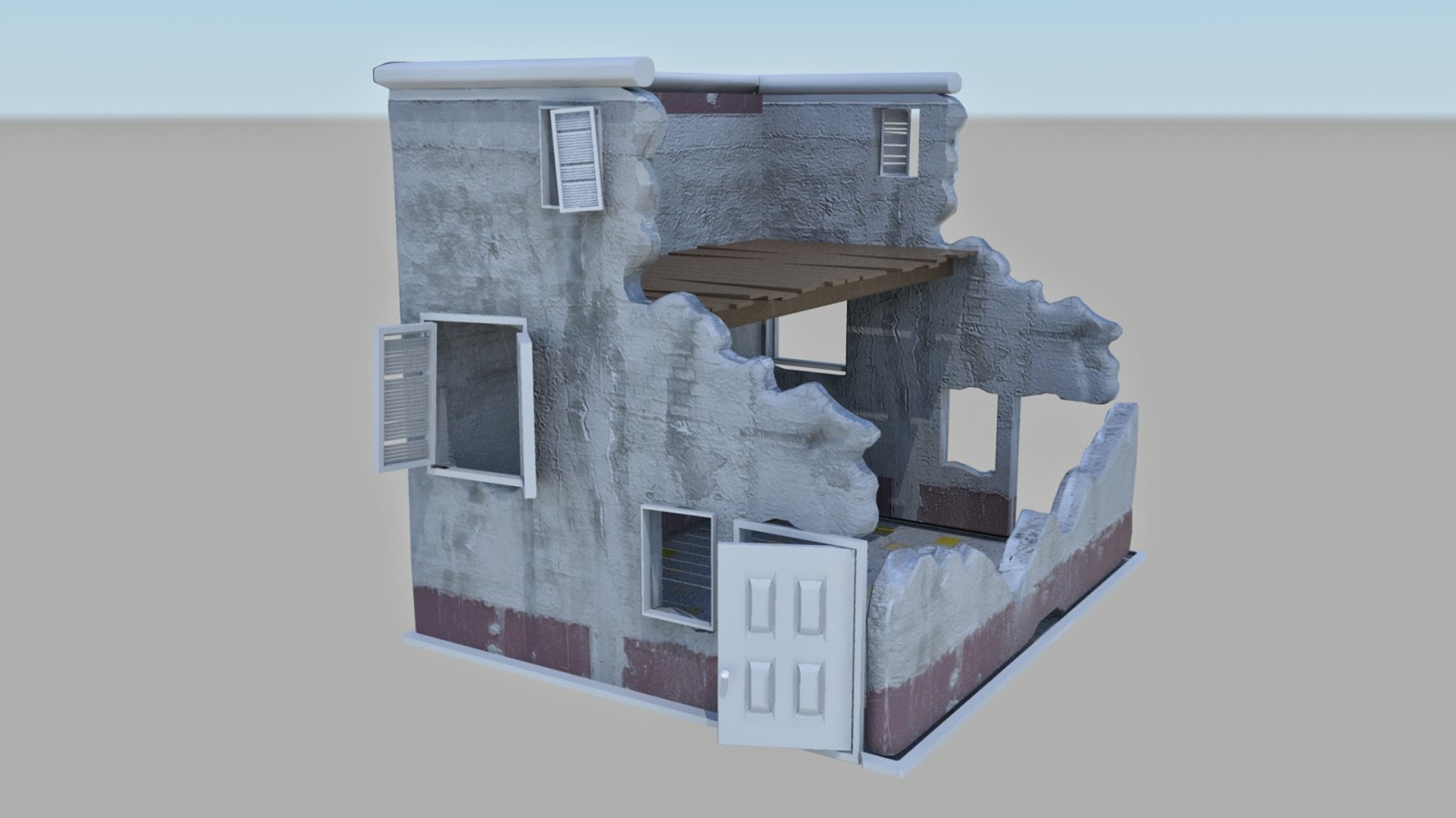
OUDF603: Damaged House Development
Here's my proof of development for my CG partially destroyed house.
The miniature scale is used as reference material.


Subscribe to:
Comments (Atom)